A brief history of the rise, fall and renaissance of the Blackletter
Sandrine Bascouert
Freelance photo retoucher and graphic designer | Expert in Image Editing
One day when we looked into shoeboxes of old photos from my partner's family, we discovered a fierce looking man, bulklily build with a thick moustache that just covered the tight space between the edges of his nose. We looked puzzled, and upon discovering the date the photo was taken - early 30s - we concluded that those were simpler times for mens grooming.
It was also simpler times for the designer who happened to explore either the early faces of mechanised typography or just wanted an old time script looking typeface, amist a flourish of geometric typefaces that were the rage in the early decades of the 20th century. There was a good, honest, clean Blackletter to be used.
Times were to become much more complicated.
One of the consequences of nazism's evil legacy after the war was the suppression of anything that resembled its style, whether accurately classified or not. Blackletter fonts, for example, became almost extinct from newspaper headlines, and were mainly used in WWII movies to depict propaganda posters.
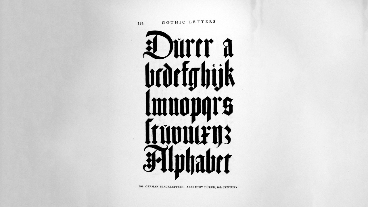
But the first book was printed in the western world with blackletter. Using blackletter was merely the willingness to reproduce the lettering seen in bibles, painstainkingly written by hand by monks, and print them for the masses. The fact that the first printing press in the west was German is an event that went to make it associated by proxy with everything German, first good, and then bad.
In its handwritten form, the blackletter was the continuation of a script called "carolingian", script which was one of the first codified type of handwriting, that became ubiqiuous as it was easier to read that the disparate handwriting of earlier writers. Making all books similarly written helped with the developping literacy, which, while contrained to the wealthy and educated, was not limited to the clergy anymore.

But more books needed producing and Carolingian was labour intensive and space hungry. Writers needed a more compact, easier to write letters to keep up with the demands of new universities and their scholars. Blackletter became a new standard - with some regional alterations, English, French, German, Italian and Dutch - which made it at once unified but also slightly variable.

When it came to have the first book printed in the west (from metal movable letters as the first way of mass-producing books), it triggered arguably the first real modern revolution. From the equivalent for a book of a life's wages for someone at the bottom of society to something everyone but the destitute could acquire, it was one - if not THE most - important event of the mid 1400s and beyond.

Over time, more readable typefaces were developed, influenced by the Renaissance's interest in the classical world and the introduction of italics (the clue's in the name!). The trend ultimately shifted from the Northern styles to the Italian ones. However, some regions still used blackletter fonts, such as Germany, where Fraktur and Schwabacher were popular. Britain also kept some blackletter elements of its own, as seen in street signs and several newspaper mastheads still in use today.

Fast forward a few centuries, any form of blackletter and most notably Fraktur types have been seen in Germany as national typefaces, and were seen to represent as much german culture as a big stein of Löwenbräu and the sight of Bavarian castles.
Then, when you are to embrace a cliché for your own country, you can count on the narrow-mindedness of the nationalist ideologues (there was another Adolf, before the other one: Adolf Reinecke) to make a statement out of a typeface.
So they used it in propaganda extensively, and rolled in it like there was no tomorrow. However, as ideologues go, Hitler decided that international recognition was a better priority than sticking to an old-fashionned script, that no one outside Germany could really read anymore. So, in 1941, the use of Fraktur for official documents was banned. And of course, for good measure, the blackletter was declared too Jewish.
But the deed was done, it was now impossible, until decades after the end of the war, to write anything in Blackletter, unless you wanted to look like a neo-nazi.
And as those things happen, after being confined to the world of heavy metal (because who doesn't like a good typeface as a shock factor), the revival of blackletter was underway in the USA with the advent of hip-hop, mainly within the graffiti sub-culture.


Of course all of these are not stricktly "frakturs", they are variations of blackletters that are less tainted, and easily recognisable as something different than the old stuff. But we've seen a resurgence of blackletter in recent years thanks to calligraphy artists and even in the mainstream space (If you've seen the Adobe Max 2023 sneak-peek presentation, you've seen the little German village on the stage and the title "sneakfest" proudly written in blackletter).
It's seen to be either a non germanic-looking version of the typeface, or a more wholesome version of Germanness.


Nothing escapes politics, even - and some would argue particularly - typography. Typography is the core element of design and design is culture. Typography IS culture, a culture that everyone who understands the same writing system can intimately get, regardless of education and background.
Hope you liked the read, and let me know if you've seen some good examples of modern use of the blackletter, particularly in branding!
Some good, modern examples from Adobe fonts:
https://fonts.adobe.com/fonts/gandur-new

https://fonts.adobe.com/fonts/fakir

https://fonts.adobe.com/fonts/lekick

Links:
https://en.wikipedia.org/wiki/Blackletter
https://jakerainis.com/blog/the-history-of-blackletter-calligraphy/
https://www.lrb.co.uk/blog/2015/may/negative-typecasting
https://letterformarchive.org/shop/the-mysterious-case-of-the-shapeshifting-poblano-blackletter/
https://www.behance.net/gallery/135799361/High-On-Type-Alphabets-Zine
https://www.printmag.com/article/tattoo-artist-typography/
https://www.juxtapoz.com/news/niels-shoe-meulman-unism-white-walls-sf/
https://fontsinuse.com/sets/483/blackletter
Travel Consultant at Liberty Travel
1moSuper interesting!