Every item on this page was chosen by an ELLE Decor editor. We may earn commission on some of the items you choose to buy.
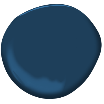
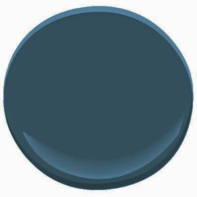
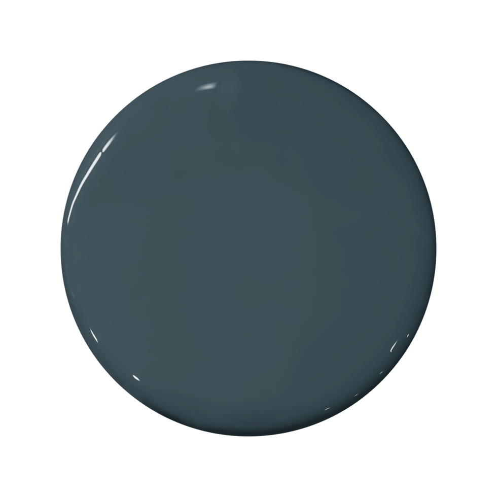
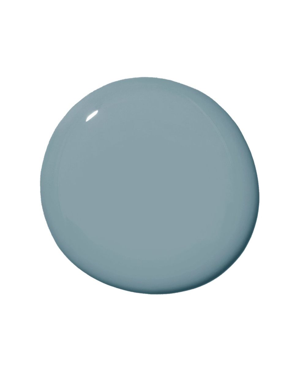
1Benjamin Moore Marine Blue 2059-10
 Courtesy Benjamin Moore
“Its remarkable saturation strikes the perfect balance between vibrancy and subtlety, making it an ideal choice for those seeking a touch of drama without overwhelming the space.” —Rayman Boozer, Apartment48
SHOP THE COLOR
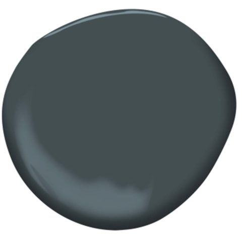
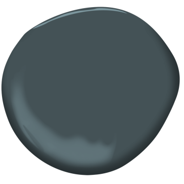
2Benjamin Moore Lead Gray 2131-30
 Benjamin Moore
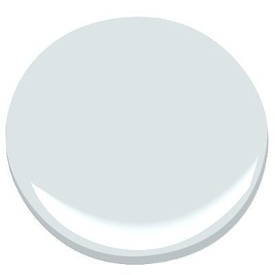
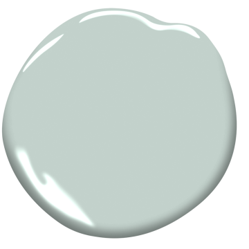
 3Benjamin Moore Silver Cloud 2129-70
 Benjamin Moore
“I’ve always been a big fan of blue when it comes to creating a sense of tranquility and calm in spaces. I think I might have found the perfect hue that is neither too saturated nor too light. Benjamin Moore’s Silver Cloud is a billowy dream of a color and lends itself well to any space where a feeling of calm would be appreciated.” —Ghislaine Viñas
SHOP THE COLOR
Advertisement - Continue Reading Below
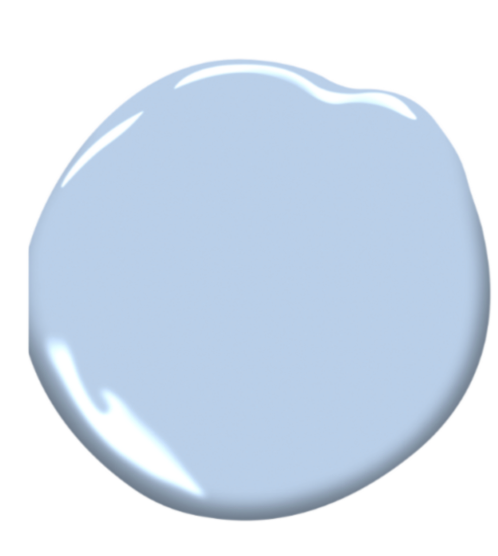
4Benjamin Moore Windmill Wings 2067-60
 Benjamin Moore
“If I had to choose a favorite, it would have to be Windmill Wings. With delicate hints of lavender woven into its ethereal blue embrace, this shade has an almost magical quality that exudes a soothing aura.” —Rayman Boozer, Apartment48
SHOP THE COLOR
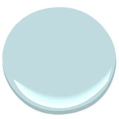
5Benjamin Moore Bird’s Egg 2051-60
 Benjamin Moore
“Bird’s Egg effortlessly captures the iconic elegance of a Tiffany box. This hue lends a subtle sophistication, elevating any room with its refined charm.” —Rayman Boozer, Apartment48
SHOP THE COLOR
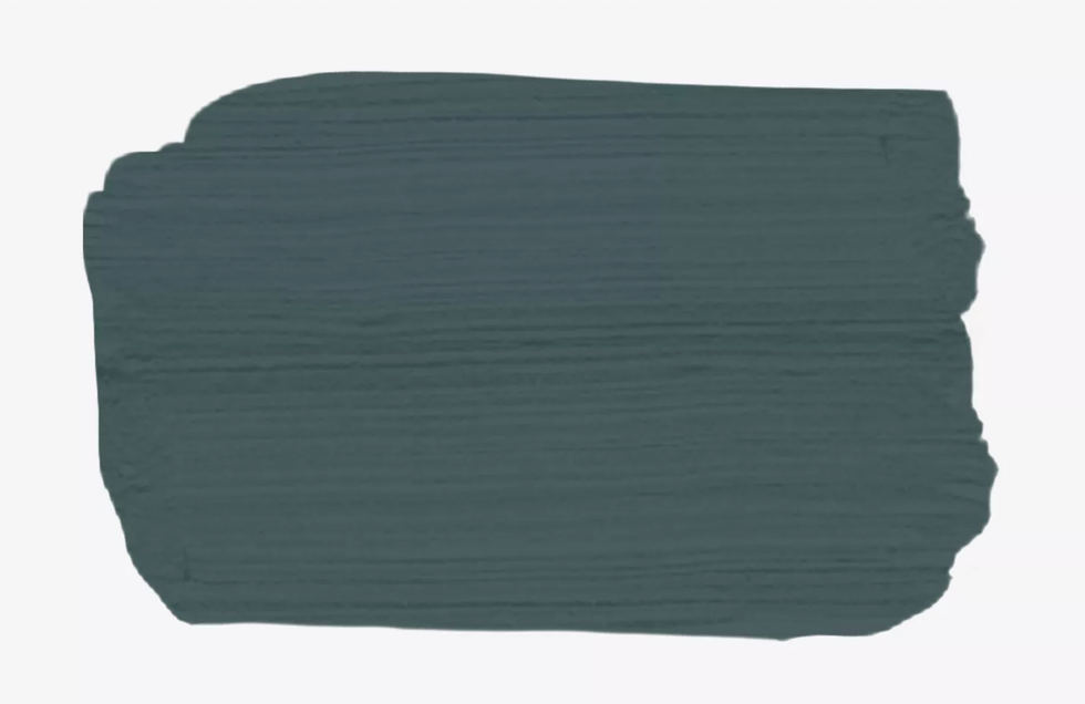
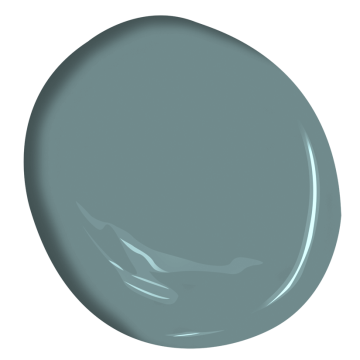
6Benjamin Moore Providence Blue 1636
 Benjamin Moore Paint
“I love that this blue has a little bit of green and a little gray. It’s moody and watery and sophisticated and changes with the light and the space.” —Jessica Davis, Atelier Davis
SHOP THE COLOR
Advertisement - Continue Reading Below
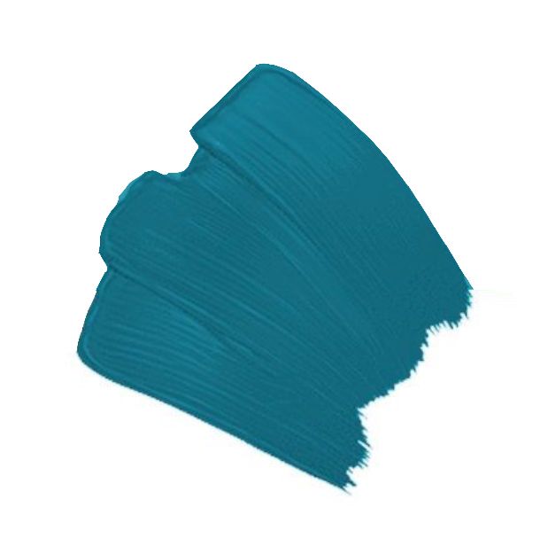
7Benjamin Moore Blue Danube 2062-30
 Benjamin Moore
“Color is an incredibly powerful tool to stimulate emotion. I use paint colors that are refreshing, calming, and flattering, which is why I love to use Blue Danube by Benjamin Moore. The color has a touch of teal, making it very versatile. The classically vibrant color radiates in the light and hits a moodier tone in darker spaces.” —Courtney McLeod, Right Meets Left Interior Design
SHOP THE COLOR
8Sherwin-Williams Seaworthy SW 7620
 Courtesy Sherwin-Williams
“This is the perfect deep blue to balance reds and oranges without becoming too primary. It’s neutral and classic but never boring.” —Miriam Verga, Mimi & Hill Interiors
SHOP THE COLOR
9Portola Paints Lost Highway
 Portola Paint
“I am a big fan of Portola Paints’ Lost Highway. It is so deep and fabulous with a skosh of teal. It looks killer with yellow, camel, red—you name it!” —Amy Sklar
SHOP THE COLOR
Advertisement - Continue Reading Below
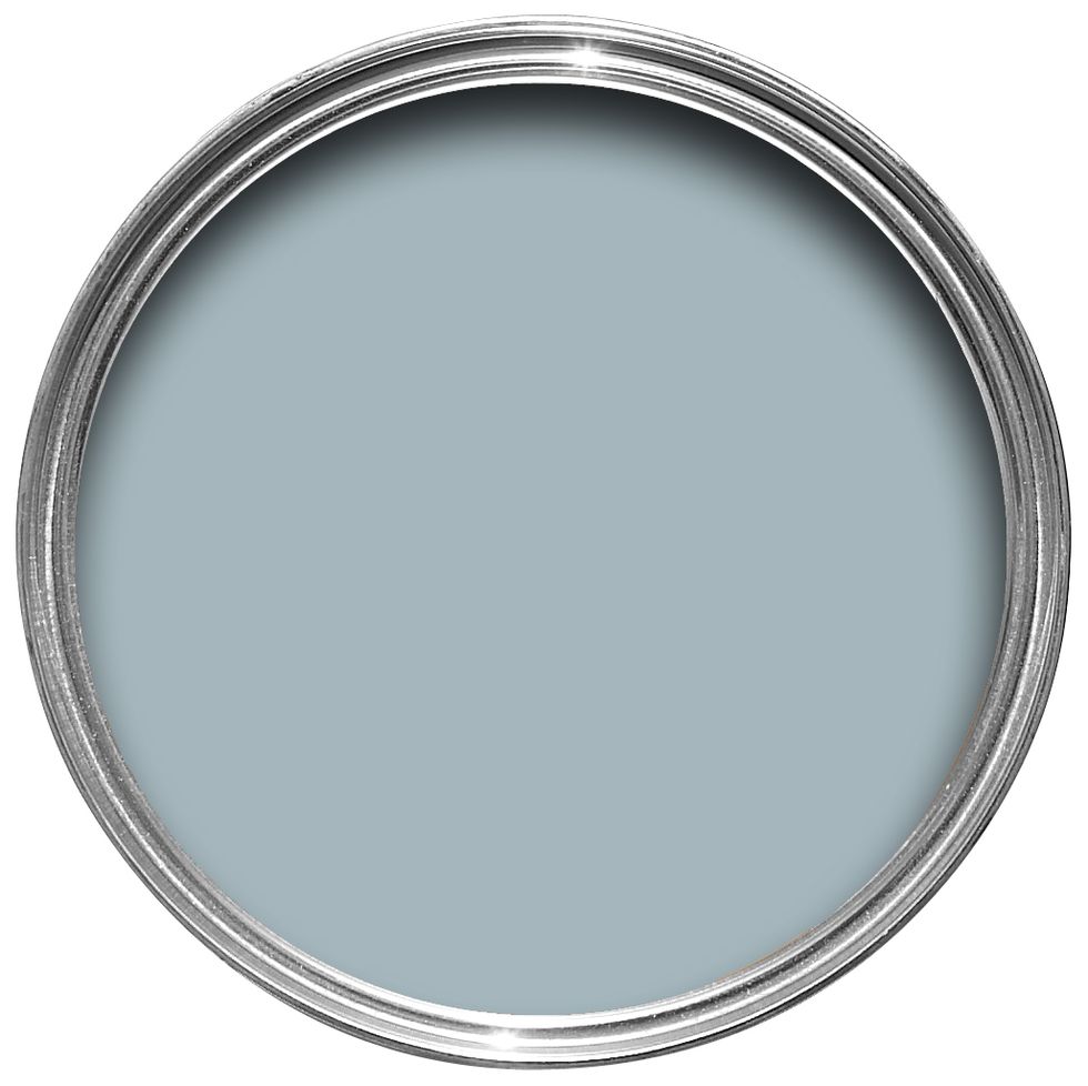
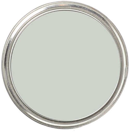
10Farrow & Ball Parma Gray No. 27
 Farrow & Ball
“I’m obsessed with Farrow & Ball’s Parma Gray. It is a grown-up and sophisticated take on light blue that doesn’t scream ‘baby shower.’ I love this color from floor to ceiling, including trim for a classic and refined look.” —Alessandra Wood, Modsy
SHOP THE COLOR
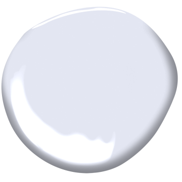
11Benjamin Moore White Heaven 2068-70
 Benjamin Moore
“The color blue, besides being America’s favorite color for decades, is the global winner by far as well. A primary color, blue is relaxing and connotes harmony, calm, and infinity. A Drake/Anderson favorite shade of blue is an ethereal wisteria, with a purple-ish cast. Our go-to for this delicious color is Benjamin Moore’s White Heaven 2068-70, the perfect celestial hue!” —Jamie Drake, Drake/Anderson
SHOP THE COLOR
12Sherwin-Williams Still Water SW 6223
 Sherwin-Williams
“Funny enough, long before I was a designer I wasn’t a fan of blue. But now, it's a color that constantly makes me smile. Every time I use a tint or hue of it in a project, it motivates me to continue to play with the color. I once used Still Water by Sherwin-Williams in a client’s bedroom; it was so perfect for the vibe I was trying to create that I vowed to never use it. It was too special to be shared anywhere else.” —Beth Diana Smith
SHOP THE COLOR
Advertisement - Continue Reading Below
13Benjamin Moore Woodlawn Blue HC-147
 Benjamin Moore
 “We love using a sky blue on the ceiling to bring the outdoors in and give the space a sense of endlessness. We painted the shiplap ceiling in a children’s library Benjamin Moore’s Woodlawn Blue, and it was a great finishing touch.” — Marguerite Rodgers
SHOP THE COLOR
14Clare Good Jeans
 Clare
Clare“When you want to add some color to a bedroom, blue is always my go-to! Good Jeans from Clare has enough depth in the color and richness, while not being too dark or overwhelming. Just like a good pair of jeans!” — Rozit Arditi
SHOP THE COLOR
15Sherwin-Williams Sea Salt SW 6204
 Sherwin-Williams
“I love this blue; sometimes it's blue-blue, and other times it’s blue-green. Of all the paints I have ever used (and there have been a lot), this is the one that changes the most based on time of day, weather outside, and natural light. One of my favorite things about paint colors like Sea Salt is simply enjoying how much they evolve.” — Isabel Ladd
SHOP THE COLOR
Advertisement - Continue Reading Below
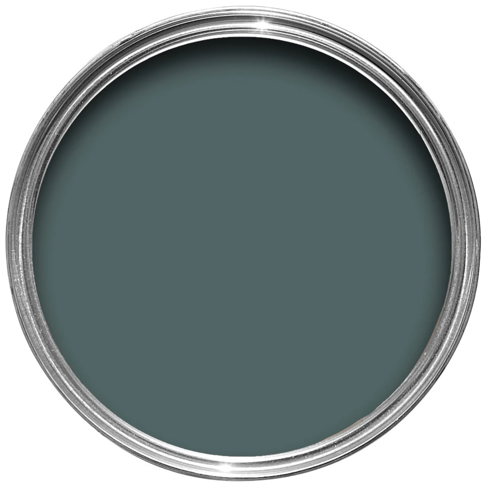
16Farrow & Ball’s Inchyra Blue No. 289
 Farrow & Ball
“Blue always seems to be crowd-pleaser, and Farrow & Ball’s Inchyra Blue might be my latest crush. A gorgeous earthy blue that you dream about.” — Kristen Peña
"As for the best blue paint, our current favorite is Inchyra Blue by Farrow & Ball. There’s no doubt this is blue, but the depth and grey undertones give the color a more modern twist rather than a straight up navy.” —Jean Liu
SHOP THE COLOR
17Benjamin Moore Aegean Teal 2136-40
 Benjamin Moore
“I really enjoy using blue hues with hints of green in them. As a California beach girl and lover of oceanic hues, I appreciate the visually calming impact they can have in a space. My go-to paint for a soothing and spalike effect that delights the senses is Benjamin Moore’s Aegean Teal.” — Breegan Jane
SHOP THE COLOR
18Sherwin-Williams Amalfi SW 6783
 Sherwin-Williams
“Amalfi is a bright blue that is perfectly named for the Mediterranean coast. It’s a burst of ‘water color’ that is both uplifting and calming. We like to pair more dramatic colors like this with neutrals to make it more balanced. It’s a great way to add bold color without going overboard.” — Beth Dotolo and Carolina Gentry, Pulp Design Studios
SHOP THE COLOR
Advertisement - Continue Reading Below
19Benjamin Moore Narragansett Green HC-157
 benjamin moore
“Don’t be fooled by its name; Narragansett Green is a hue of blue that we’ve been using as a statement color. It’s both moody and sophisticated with a deep, nautical flair.” — Chanae Richards
SHOP THE COLOR
20Behr Atlantic Blue
 Behr
Behr"I love Atlantic so much that I've used it in my own home. It's literally everywhere! In the living room, on an accent wall in the dining room and on the deck...yes, the deck is stained in the same color. And our staircase is too!" —Chanae Richards
SHOP THE COLOR

Kelsey Mulvey is a freelance lifestyle journalist, who covers shopping and deals for Good Housekeeping, Women's Health, and ELLE Decor, among others. Her hobbies include themed spinning classes, Netflix, and nachos.
Advertisement - Continue Reading Below
Advertisement - Continue Reading Below
Advertisement - Continue Reading Below

