**Tags :** #composition #color #palette #atmosphere #atmospherics #photogrpahy #entourage #gac #frame [[Diamond 7 - Creative IO]]

# Learning From **The** Masters : Gregory Crewdson's Urbanscapes
View fullsize

Crewdson G., Banks R. (2008), Beneath the Roses, New-York : Abrams
## **About the photographer...**
Gregory Crewdson is an American photographer born 26 September 1961 in Brooklyn, New York.
His work mainly consists of elaborately staged surreal scenes of American homes and neighborhoods. Although his work counts many interior photographs shot in specific soundstage, in the present article we're going to focus on an exterior shot, trying to get as much theory and tips as we can from a thorough analysis.
I personally am a huge fan of Crewdson's work. Whether it's the eerie feeling you get when looking at his images, or the mind-blowing amount of details a single image can hold. Each of his image has a cinematic feel and stimulates the viewer imagination by disseminating many details to support a hidden narrative. Physically speaking, it is quite a singular experience to get lost in his large-scale print (we're talking above 2m wide). Another noteworthy detail is that, from what I recall, none of his photograph (at least in the Beneath The Roses series) have a title.
Technically speaking, most of his early images were shot on film with a Hasselblad Sinar 8x10 camera, a pretty impressive and imposing gear, quite in sync with the scale of the projects he depicts. He recently switched to digital with a Phase One camera that delivers 100Mp. Pretty neat.
As we'll see more in depth below, Gregory Crewdson is a peculiar photographer. He builds soundstages from scratch for interior shots (kind of like what we do as archviz artists) and has a whole crew for shots on location where he systematically uses additional artificial lighting. That is why all his exterior photographs are shot at twilight, when you can have a nice mix of artificial lighting and natural lighting. Earlier in the day you wouldn't see any artificial light, and later the contrast would be too harsh. As Russell Banks puts it, dusk is particuliar time where things shift from the outside to the inside world, from the public space to the private intimate sphere. This in-between is a recurrent playground for Crewdson.
Although for a single photograph Gregory will take up to 40 different frames, in terms of time frame we're talking less than half an hour of actual shooting on location.
Among his personal influences, Gregory mentions Diane Arbus, Walker Evans, David Lynch and Albert Hitchcock.
## **About the photograph itself...**
The photograph I chose for this first article is one I find quite emblematic of Crewdson's way of depicting urbanscape in small typical American towns (all of his images are shot in Massachussetts). It is from the monograph Beneath The Roses that gathers images taken between 2002 and 2008.
The image shows a nearly empty main road passing through a neighbourhood after the rain (it actually is artifically hosed down). One car running towards us and a lady facing the building on the left, absent-minded. The mountain in the background gives a glimpse of the surrounding natural landscape. Here and there we catch details of interior space through the windows, although we can't see any other inhabitant in the whole image.
## **Composition Principles**
View fullsize

A simple trick when you want to analyse properly the composition of an image is to turn it in black and white mode. That way your eye won't get distracted by colors and saturation.
View fullsize

One thing we can notice quickly in this image is that the camera level is not a standard eye-level. If we draw lines to find the vanishing point, we can indeed see that it's about twice the height of the woman, which suggests a camera height of approximately 3 meters.
Typical rendering will usually use a standard eye level (around 1.65m), but we notice here that being a little bit higher helps us in getting more informations on what happens further down the road (which would otherwise quickly be obliterated by cars or people if we were standing lower). We can also see a little bit deeper into the buildings which is a really good thing if we want to animate in a more complex way the interior of a building and still keep it legible.
Still regarding those diagonals, we can see that these strong lines structure the whole image with a vanishing point quite far on the right, leading right down the road, in an open area of the image.
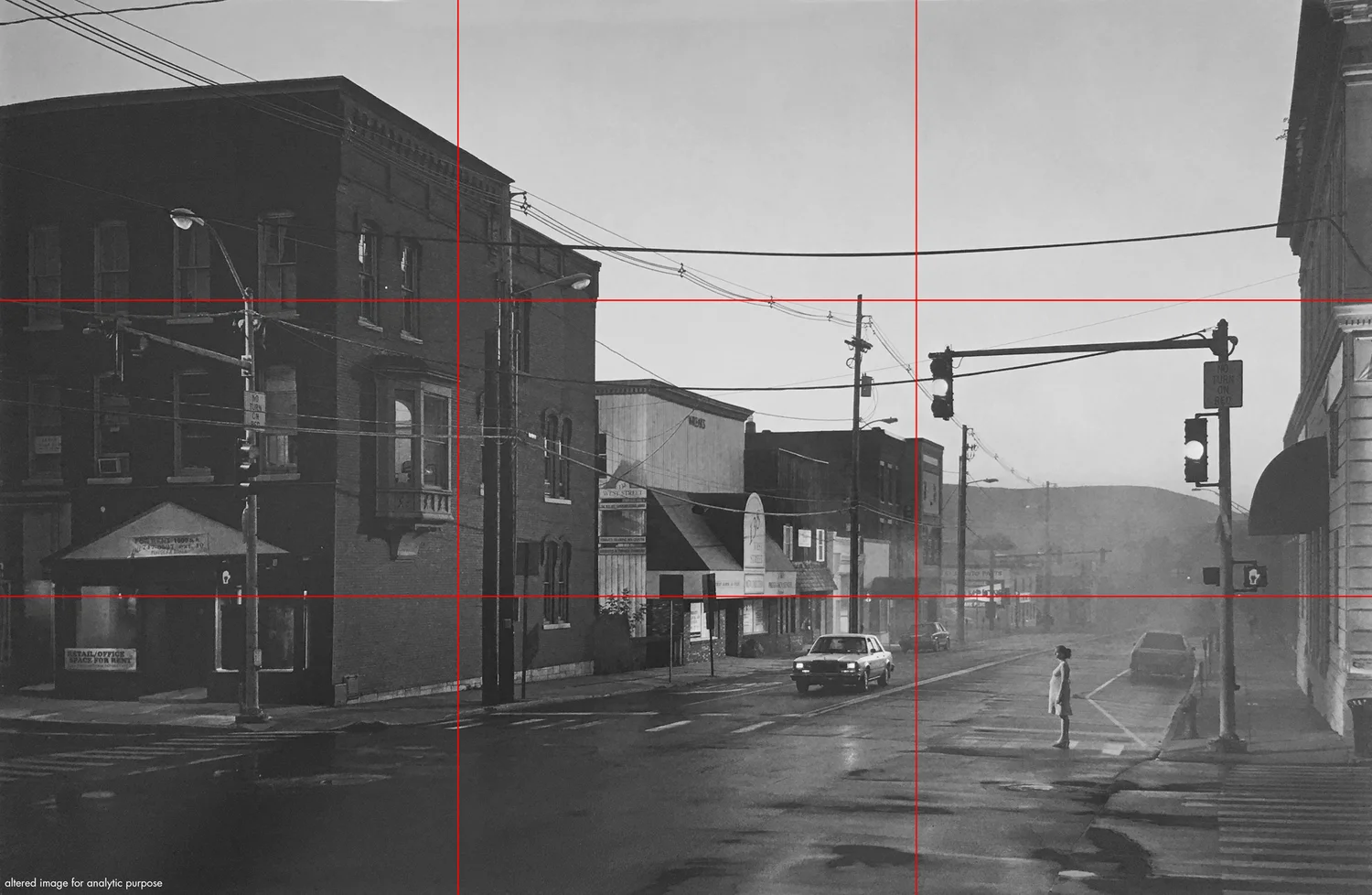
If we overlay the grid of the rule of third we notice that our horizon line sits perfectly on the lower third of our grid. This is a really simple yet efficient rule if you want to balance your image. Depending on what you want to insist on (the ground - positive space -, or the sky - negative space) you can place your horizon either on the upper or lower third.
In the rule of thirds grid, we tend to consider, as a rule, the lower right third to be the area of maximum impact. This means we would intuitively place the most important thing in this area because this is the last part of the image we read, therefore the last thing our eye will keep in mind after viewing the image once. This is of course debatable, but it seems to work in most cases. In our case we can see that we have, roughly :
- the woman, alone.
- a car, alone as well.
- more broadly speaking, the open area of the street, which leads to the mountain in a diagonal dynamic
We can also notice a strong contrast between the left part of the image (left third) which is almost entirely dark and the two other thirds where there are about half of sky and half of ground/background. This also creates a dynamic that leads or eye from the left to the right, from the dark to the brighter area.
If the building on the left was brighter (say a clean white brick) the composition of the overall image would change dramatically. The contrast black/white that leads our eyes to the right would be less legible, therefore less effective, and we'd lose the overall dynamic of the composition.

Using the threshold adjustment layer, we can quickly isolate dark from bright areas. The sky being, oftentime, the brightest part of an image, this helps us identify the amount of negative space in the image.
Negative space, or breathing space as I like to call it, is the part of the image where there is "nothing". It is generally sky, but it could also be a wall with a simple texture and no openings. Any homogoneous surface is a potential negative space. The point of having breathing space in your image is to counterbalance densely detailed and populated areas. This will help in balancing your image.
The thing you have to keep in mind is to precisely place your breathing space so that it reinforces your composition rather than breaks its dynamics.
For instance, here the negative space creates a triangle pointing to our vanishing point. This reinforces the overall composition.
Now, if the building on the left was smaller, and the building behind it much bigger. Our sky area would appear more horizontal, symmetrical even. This would completely break the dynamic of the overall composition of our photograph.
View fullsize

A cool tip to analyse an image, or check your composition is coherent, is to enhance the contrast of your image a little and add a gaussian blur. A quicker way to do this is to actually look at your screen with half-closed eyes (your eyelashes will blur your vision and alter the contrast of the image you perceive).
Here again, you can see that the bright areas are :
- the road that creates a diagonal to the vanishing point
- a building on the left that creates a bit of contrast
- the door of the car
- the woman which creates a vertical line because she's brighter than the road
This builds up in a good way on the dynamic we've noticed earlier.
View fullsize
Although we've seen there are strong diagonals that draw your eye to the right of the image, there is an interesting foreground that relies on a different dynamic.
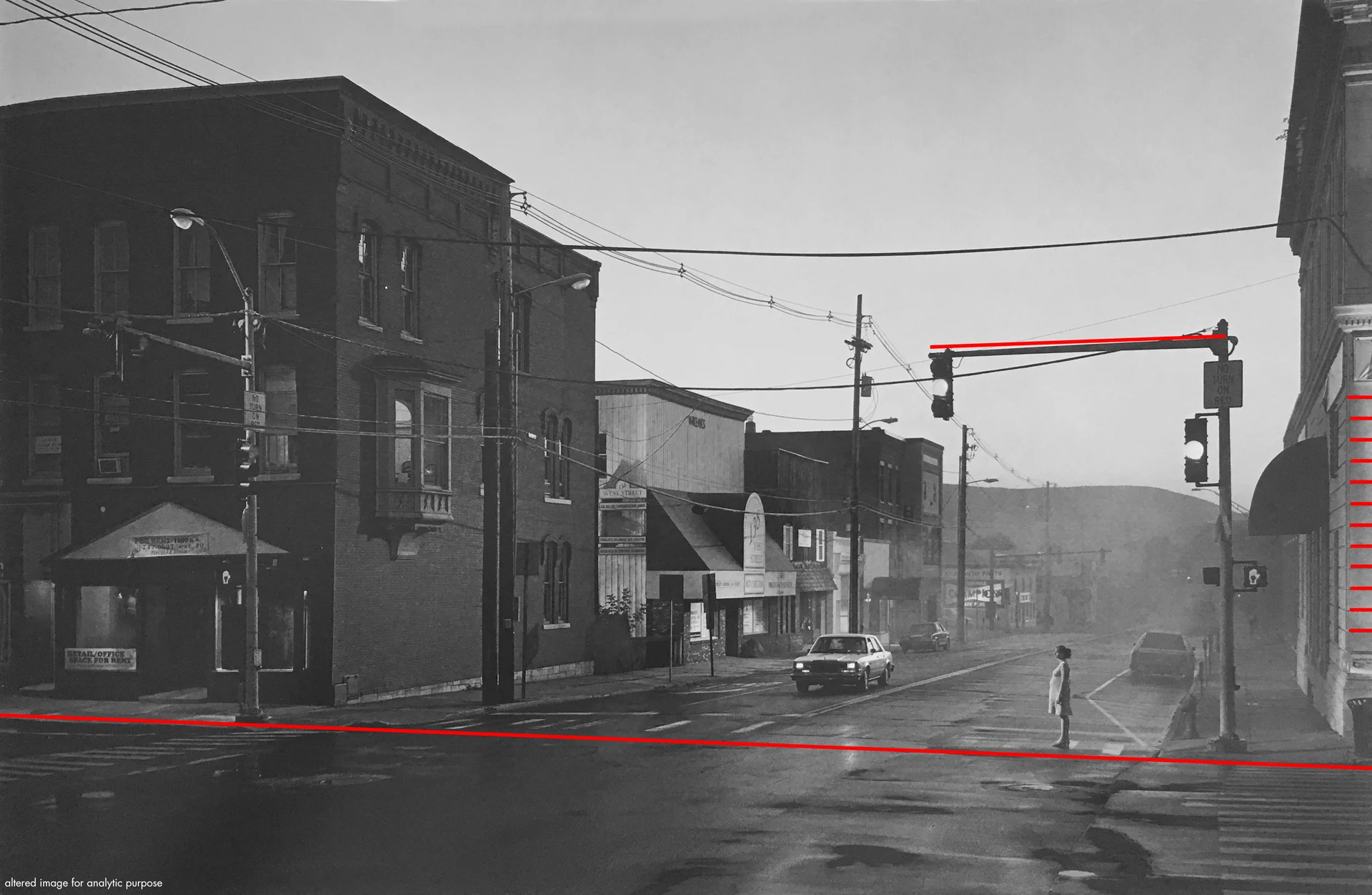
As you can see, there are important horizontal lines at stake.
- The traffic light with a strong contrast on the sky
- One comes from the sidewalk we're facing, which is multiplied with the white crosswalk
- The shadow line of the stonework on the facade on the right
- Acroterions of both buildings on the left and far right
The lower horizontal lines marks an interesting shift in density. Below the line the street is completely empty, therefore our whole foreground is empty, which is quite rare. And above the line we have the whole image in short. Notice that the woman stands right on this imaginary line, which anchors even more its positioning in the image.
View fullsize

Another interesting dynamic we can notice in this image is the principle of the frame within a frame. As we'll see in another instalment of this series, Crewdson oftentime use this trick in interior photograph. But it is interesting, this time, to see it into place in an outdoor setting.
As you can see on the image above, the empty space in the foreground and the first buildings on each side creates an imaginary frame. The traffic light, with the contrast it creates on the background, creates another frame. We can even divide this frame in two sub-frames, one with and one without the sky.
The woman, interestingly, is in both frames. More precisely, she's on the right third of the large frame, and right in the vertical axis of symmetry of the secondary frame.
View fullsize

Another small detail that I like. The mountain is framed in a way that makes it point downard, therefore leading the eye of the viewer to the women, in a kind of spiraling dynamic (from the dark left area, to the bright area on the right, to the birhgter woman a little bit lower).
At first sight this image does look pretty simple, but you see that when you start analyzing every details, you start to understand even more how logically everything falls into place and serves the overall composition of the image.
As we'll see now, contrasts, saturations and hues also play a huge part in the composition.
## **Hue, Saturation, Value**
View fullsize

On the image above you can see the levels of the overall image. It is interesting to see that there is a really nice range of values. No pure blacks, no pure white. Just a nice gradient of greys.
If we now look more locally in the image, there is one interesting phenomenon that we can notice. The contrast decreases as we go further down the road. This is a natural phenomenon, but Crewdson tends to play a lot with it in his exterior photograph. As you can surely notice, there is a kind of smoke or fog in the background. This smoke is actually artificial, and spread by a member of the crew at the beginning of every shooting. This trick is interesting in several ways :
- It hides gradually the background of the image, which focus the attention on the middle ground and the foreground.
- It creates a smoother transition with the sky and the far background (the mountain).
- It decreases the contrast in the background area, which also helps refocusing the attention on the middle ground and the foreground.
I find this trick to be a clever way to deal with transitions between rendering and backdrops.
View fullsize

As mentioned in the introduction, Gregory Crewdson relies a lot on artificial lighting to compose his image. Waiting for twilight gives him a nice cold ambient light. He then precisely place spotlighs (on cranes we can't see in the picture) to illuminate specific part of the exterior set.
**Directional Lights**
- On the left illuminates the sidewalk.
- On the left, pointing upward, illuminates the facade
- One light from the right illuminaites the whole brick facade of the main red/orange building. You can see the cast shadow from the oriel window.
- One light, behind the same building, is point upward and illuminates the white wooden building.
- In the far background, illuminates the billboard
- Finally, there's a strong light facing the woman.
Directional lights play a big role in the hierarchy of the image. Since our eyes are drawn to light naturally, these lights directly have an impact on the way we read the image. If the red facade was not lit, it would not catch our eyes at all and we would go straight to the right of the image. Same with the woman. With ambient lighting she would blend in the street and would become unnoticable, whereas now, she stands out from her surroundings.
**Point Lights**
- In the office space on the left
- In the flat above
- The traffic light (red on the left, orange on the right, green in the background)
- Car's headlights
Point lights add depth in otherwise quite dark place. Although there are not extremely important areas of the image in terms of composition, they play a big part in the narrative and add a nice layer of details on the overall image. If you try to picture for a minute the builing on the left with nothing behind any of the windows, the dialogue between the building and its interiors and the woman across the street would lose its density.
Contrary to what we could think, the lighting of this scene is far more complex that what it looks like. And actually, the funny thing is that none of the actual streetlight are used. Concretely, this means that building a coherent composition with your artificial light is more than just properly setting up the streelight along sidewalks. Each building must be taken care of individually, should it be lit, or not? Doest it enhance the legibility of the composition, or harms the composition?
Same goes with the people you put in your image. Depending on how you light them, they will catch more or less the attention of the viewer, and impact the composition accordingly.
View fullsize

If we use our check filters to isolate saturation, we get the image above.
As in most cases, our sky is the most saturated area. Since it's refelcted in the asphalt, the road does look saturated too. The background with the mountain and the fog are quite saturated as well.
Finally, the whole foreground is desaturated, and only one facade of the building on the left (the one in the light) has higher saturation.
It is always a good thing to double check that there are no incoherences in your image in terms of saturation and that the hierarchy makes sense.
In this image for instance, the most saturated elements are the red hands on the traffic light for pedestrians, which is bright red.

Switching our check filters to isolate hues, we get this new image. It is interesting because it emphasizes the fact that the whole image relies on a quite small color palette base on complementary colors. Although the image uses variations of orange and blues, it still manages to get an interesting density and complexity.
The more interesting thing is how these different hues are placed in the image (see second image in the carousel above).
The main blue hue is seen in the sky, the background mountain, the building on the left further down the road, as well as the road, in a diagonal way, just like we had with the contrast earlier.
The orange hue can be seen only on the building on the left, on the traffic light, and on the woman, which makes her stand out from the street even more. It's an interesting detail because the woman and the two traffic lights are in the same plane
This chromatic harmony would'nt work as well if the lights were green for example. Because the green lights chromatically relate more to the blue background. That's also why the faint trafficlight in the background is green.
## **Deliberate Alterations**
As a simple exercice, I deliberately changed some aspect of the image to better emphasize how important these details are to the overall dynamic of the composition.

For instance, let's play with the color of the building on the left. First image is the original, second one the building fits the overall hue of the image which is blue.
You can see how it stops interacting with the woman across the streets, and how "frame within a frame" principle is less legible.

In this case, we take away the woman. You can notice how the traffic light and the overall composition, which in the original image build up a dynamic to center the attention on the woman, now creates a weird balance since the attention is focused on an empty area. The attention is then slightly shifted to the car, but its position in the overall image doesn't feel right.


One last alteration for funnsies. Let's talk about framing. You know how sometimes it looks weird to get in your frame just a tiny bit of a building? Oftentime you would just crop it out of the image. But if we do this in our image here, see the tremendous change it does in the perception of the composition.
Having a building on the right, even such a small part, actually helps in two things :
- Its mass contrasts with the sky and helps in creating the "frame within a frame" effect.
- The diagonal of the acroterion leads down to the woman.
If we take it away, we have the impression that the sky will go on forever on the right, actually opening the whole image to the right side instead of containing the viewer on the traffic light area.
### Let's stop here with the overall analysis of the image. For legibility sake, here's a quick breakdown of tips and tricks we, as archviz artists, can learn from Gregory Crewdson's approach to urban photography and implement in our daily worklfow.
---
## **Key Concepts**
- ### **Place the camera higher than eye level (about 3m)**
- ### **Use the rule of third and place the lower third on the horizon line**
- ### **Use negative space in a way that builds up your composition**
- ### **Compose your image with the frame within a frame composition principle (use building facade, street furniture, trees, backdrops to create your frames)**
- ### **Use fog in the background to smooth transition between middle ground and background in terms of contrast and hues**
- ### **Shoot around twilight hour to get a nice mix of natural and artificial lights**
- ### **Use well considered directional extra lights on specific buildings you want to emphasize in your composition**
- ### **Place entourage in a way that reinforces your composition rather than just populate your image to make it lively.**
- ### **Rely on a simple chromatic palette with two complementary colours to better serve your overall composition**