:quality(75))
:quality(75))
:quality(75))

The color pink is far more than just a hue. Over the years, artists and society have used the color pink to communicate many different sentiments. It's a color that incites opposing opinions and is also a reflection of cultural shifts.
From bold tones of hot pink and bubblegum pink that scream excitement and enthusiasm, to the soft shades of pale pink that represent traditional femininity and the millennial generation, this color encompasses a broad spectrum of emotions.
Jumpstart your ideas with Linearity Curve
Take your designs to the next level.
In this blog post, we uncover the ever-evolving pink color palette, exploring its significance in graphic design, culture, and beyond.
1. The history and significance of the color pink
Origin story and evolution
Pink, the color of a namesake red flower (also known as dianthus plumarius), carries with it a rich history that dates back centuries. The origin of pale pink can be traced to nature itself, where the delicate blush of cherry blossoms and other flowers served as early sources of inspiration for this captivating hue. It is, in essence, the embodiment of nature's own palette.
In the late 17th century, what we now refer to as pastel pink, was first officially recognized as a distinct color and noun. Since then, it has evolved into a wide range of shades - from shocking pink to dusty pink. This evolution mirrors the shifting tides of culture and art, where pink has been used by artists, designers, and advertisers to convey a wide range of expressions.
Pink in art
Throughout history, artists have harnessed the pink color palette to communicate sentiments and ideas. However, it was only until the Renaissance that artists openly acknowledged shades of pink as an integral part of their artistic palette.
A notable instance is found in the works of the Italian painter Cennino Cennini, who aptly characterized flesh-like soft pink color as a harmonious fusion of Venetian Red and St. John's White. He deftly utilized this newfound shade to impart a luminous quality to the skin of religious icons and dignified individuals alike.
From the graceful use of pastel pink by 18th-century Rococo painters like François Boucher to the bold statements made by pop art pioneers like Andy Warhol using vivid shades of pink, this color has consistently been important in the art world.
Contemporary artists like Tracey Emin of the Young British Artists have masterfully utilized the color pink in their artworks, including pieces like "Psyco Slut" and her 2019 "A Fortnight of Tears" exhibition.
Emin's deliberate choice of pink often serves as a provocative and emotional symbol, invoking feelings of vulnerability and intimacy. In "Is Anal Sex Illegal" and "My Heart Is With You Always," she employs shades of pink to explore themes of love, desire, and societal taboos, creating a striking contrast between the color's associations with feminine innocence and the complex subject matter of her art.
JeongMee Yoon is a renowned contemporary artist celebrated for her innovative exploration of the color pink within "The Pink and Blue Project" series (2005-08). One particularly captivating piece from this collection is "Seo Woo and her Pink Things," a mesmerizing study of the color's cultural significance.
In this artwork, Yoon skillfully portrays her daughter, Seo Woo, immersed in a sea of pink possessions, showcasing the pervasive influence of societal gender expectations on children's choices. Through her photography, Yoon draws attention to how the color pink can symbolize and perpetuate these norms, igniting important conversations about color, identity, and the lasting impact of such associations on our lives and the next generation.
Cultural and psychological significance
Pink's fascinating evolution -- from deep pink to French pink -- has left an indelible mark on culture and psychology alike, shaping perceptions and attitudes.
The academic article titled 'Pink is for girls...' sheds light on the deeply ingrained societal associations of soft pink and baby pink with femininity. For decades, these shades have been used to symbolize traditional gender roles, reinforcing notions of girls' and women's identity.
However, this narrative surrounding pink is in a state of flux. Society is increasingly recognizing and embracing the fluidity of gender identity, and as a result, pink is evolving to become a symbol of inclusivity. It now extends its embrace to people of all gender identities and expressions, challenging stereotypes and norms.
Shocking pink, formulated by Elsa Schiaparelli in 1937, stands as a vivid testament to the color's ability to provoke thought, challenge conventions, and inspire change. It serves as a vibrant reminder that color can be a powerful tool for making bold statements beyond being known as a feminine color.
As a generation signifier, the transition from the subdued millennial pink (muted pink) to the bold Gen-Z yellow (lemon yellow) signifies more than just a shift in color preference. It reflects the evolving tastes and values of younger generations. This transition signifies a departure from conventional norms, emphasizing individuality and the celebration of diversity.
2. The pink color palette
What's a color palette?
In the world of graphic design and illustration, a color palette is a carefully selected set of colors used to convey a particular theme or message. It serves as the foundation for creating visually appealing and cohesive designs. The significance of a well-crafted color palette lies in its ability to evoke specific emotions and create a harmonious visual experience. Designers and illustrators understand the power of color and the role it plays in influencing the viewer's perception.
Pink color schemes
Pink, with its diverse range of shades, offers a plethora of possibilities for creative professionals. Complementary colors, such as lime green, can be used to create striking contrasts. These beautiful color combinations, derived from the color wheel, offer an array of options to explore. In graphic design and illustration, a design project's success often hinges on the selection of the right accent colors.
Ready to create brand assets that pack a punch?
Visit our Academy to learn how to use color palettes.
Pairing ultra pink with reddish pink can result in a bold and vibrant composition.
While neon pink combined with coral pink can bring an electrifying energy to your designs.
For a more delicate and sophisticated look, consider blending champagne pink with baby blue or pastel blues.
Incorporating rose quartz as a complementary shade can bring a touch of elegance and balance to your palette.
Using pink's contrasting complementary color, green, in designs is another surefire way to amplify a design.
Each color within the pink spectrum offers a unique personality and emotion, making it essential for designers and illustrators to carefully curate their color choices.
Shades of pink hex codes
In graphic design and digital art, precise color selection is paramount. Hex codes provide a standardized way to represent colors in the RGB color model. Below, we've curated a selection of our favorite hex codes for various shades of pink.
Whether you're working on a web design project or creating digital illustrations, having these hex codes at your disposal will help you achieve the perfect pink hue to convey your message effectively.
From the rosy pink reminiscent of blooming flowers to the cooler, more purplish tones, you'll find an array of options to suit your creative needs:
| Shade Name | Hex Code |
|---|---|
| Rosy Pink | #E9967A |
| Nude Pink | #FFDAB9 |
| Purplish Pink | #FF69B4 |
| Bright Magenta | #FF00FF |
| Cool Pink | #FF6F61 |
| Misty Rose | #FFE4E1 |
| Light Hot Pink | #FFB6C1 |
| Light Pink | #FFC0CB |
| Steel Pink | #CC33CC |
| Vibrant Pink | #FF007F |
| Thulian Pink | #DE6FA1 |
| Schauss Pink | #FF91A4 |
Linearity Curve's palette tools
Creating the perfect pink color palette is made more accessible with tools like Linearity Curve. Our innovative software provides designers and illustrators with a user-friendly interface for selecting, customizing, and organizing colors. Whether you're aiming for a shocking pink or a subtle pink color palette, Linearity Curve's features enable precise color adjustments to achieve your desired effect.
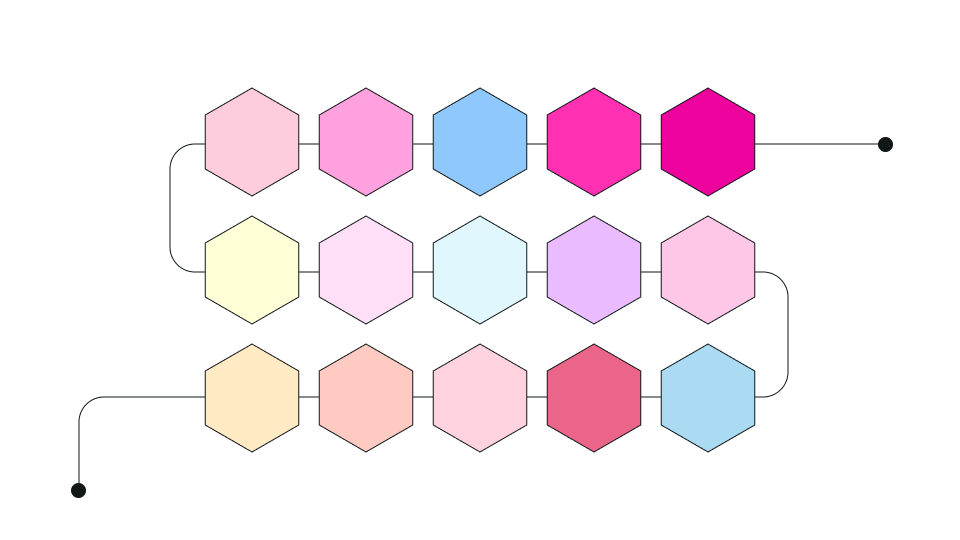
If you'd like to try our pink palettes out for yourself, you can download them below and import them into Linearity Curve to use in your own designs.
Each palette has been crafted by our in-house design team, who view pink as "a design chameleon, that adapts to any style or mood, adding a warm touch to any design."
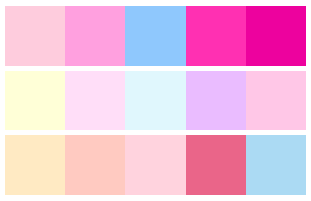
Download our pink color palettes:
:quality(75))
:quality(75))
Barbie-inspired color palette
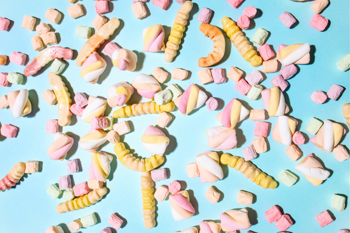
Candy color palette
Sunrise color palette

3. Pink is in: examples + trends
Modern-day impact of pink
No longer confined to a single stereotypical shade, the color pink has evolved into a versatile tool for designers to convey various emotions and messages.
How shades of pink can enhance graphic designs
Pink, in all its variations, has a unique ability to captivate audiences of all ages. Designers can use pink to create a burst of color compositions, for catching the eye in advertisements, posters, and branding materials. Whether it's a daring hot pink or a delicate baby pink, this color's bright and cheerful nature instantly grabs attention.
The new pink and modern feminism
In recent years, pink has taken on a new role in the context of modern feminism. Instead of representing traditional gender norms, pink is now celebrated for its strength and empowerment. The color is now used to convey a sense of confidence and determination.
The association of pink with femininity is gradually fading, and modern men are embracing this once-stereotyped color with confidence. Designers are experimenting with pink in ways that challenge traditional gender norms. Whether it's a masculine color scheme featuring bold pink shades or subtle accents of pale pink in a minimalist design, pink is finding its place in the world of men's fashion, branding, and graphic design. This shift demonstrates how color can transcend stereotypes and adapt to evolving cultural attitudes.
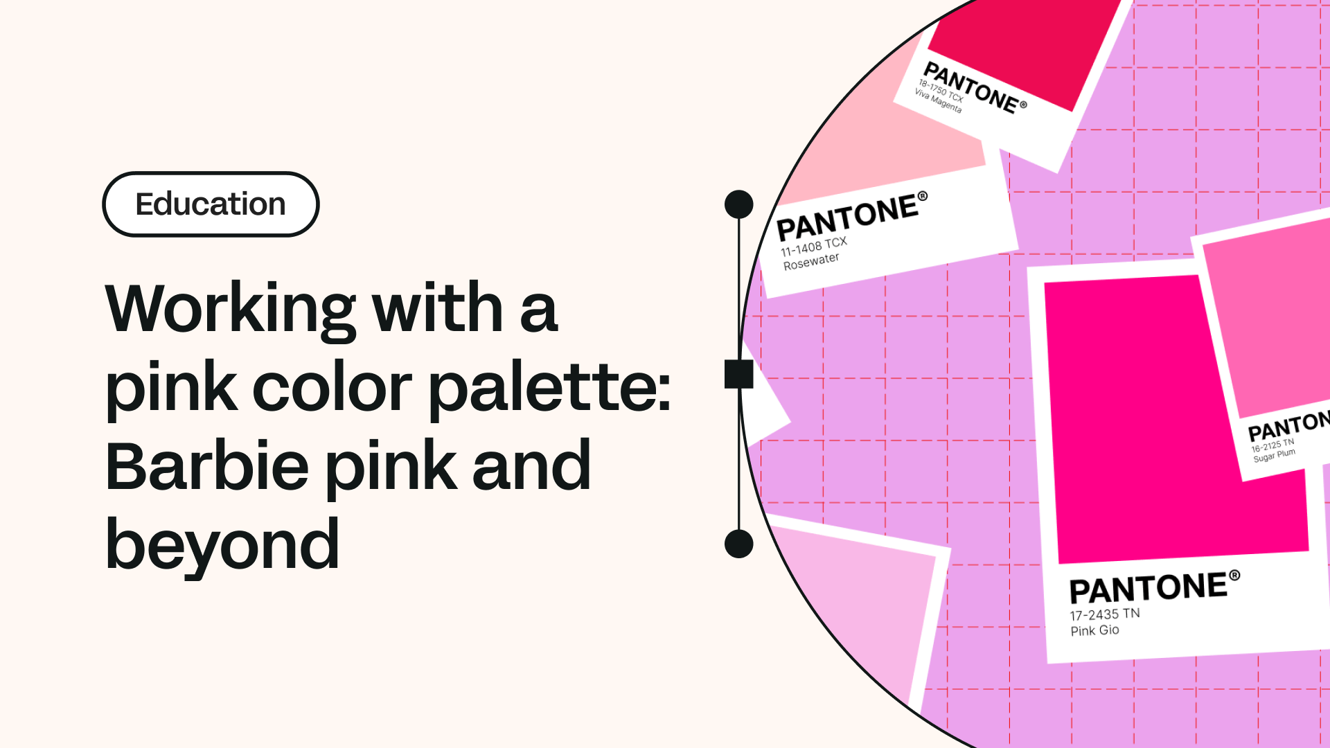
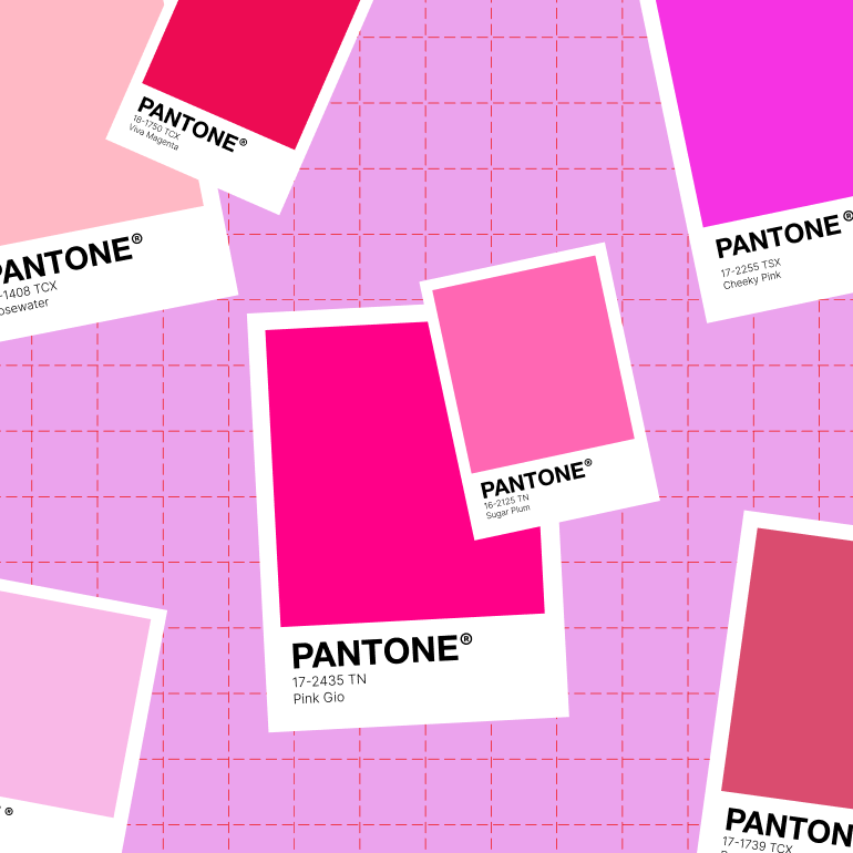
The Barbie movie and pink’s resurgence
The release of the Barbie movie in 2023 sparked a resurgence of pink in graphic design. Designers have harnessed the power of this popular color to create eye-catching designs for campaigns and products.
Ready to create brand assets that pack a punch?
Visit our Academy for free color palette design courses.
For instance, Beis collaborated with Barbie to create a magenta-pink luggage set, capturing the essence of the iconic doll's style.
Airbnb's real-life Barbie house became a symbol of luxury and extravagance, complete with pink interiors and accessories.
Even established brands like Birkenstock and Uno have embraced the Barbie influence, releasing pink-colored products.
Burger King, in Brazil, introduced a Pink Burger with Barbie-inspired packaging and a sauce with pink undertones.
Impala Skates combined complementary yellow with Barbie pink to create skates that not only perform well but also make a fashion statement on the roller rink.
Pink in pop culture
Pale to brighter shades of pink have infiltrated pop culture across various domains, from music to technology, beauty, and everything in between.
Taylor Swift incorporated pink into her "Lover" album cover design, where the delicate pink shade reflects the album's romantic subject matter.
T-Mobile continues to utilize a vibrant pink as its signature color, representing energy and connectivity in the digital age.
Beauty brand Glossier relies heavily on millennial pink and pink accents in its branding, conveying a sense of modern-day 'girl power'.
Boy Smells, a fragrance company for men, uses pink packaging to challenge traditional notions of masculinity and femininity.
Even financial technology company Klarna opted for a soft pink as part of its logo color scheme. This bold breakaway from conventional corporate colors, like navy blue, has seen the brand gain popularity amongst a digitally savvy demographic.
K-pop girl group Blackpink incorporates pink not only in their name but also in their visual identity, aligning perfectly with their vibrant and energetic style.
Think pink!
The meaning of pink in graphic design has evolved far beyond its traditional associations. It has become a versatile and impactful tool that can convey a wide range of emotions, challenge gender norms, and make a strong statement in various industries. From its resurgence thanks to the Barbie movie to its presence in pop culture and its acceptance in modern masculinity, pink is proving its enduring relevance.
Designers continue to explore and experiment with pink in innovative ways, ensuring that this cheerful and bright color palette remains a prominent feature in the visual landscape for years to come.
Jumpstart your ideas with Linearity Curve
Take your designs to the next level.
Share this!
Tracey Che King
Tracey is a Content Writer for Linearity in Berlin. Her hobbies include content creation, painting, fashion, and food.