


Using Complementary Colors in Photography
Detailed guide to using complementary colors in photography. Learn the technique + get inspired with 30 stunning examples!
Shotkit may earn a commission on affiliate links. Learn more.
As photographers, we sometimes tend to get carried away by the technical side of things.
There’s no doubt that striking the right balance between aperture and shutter speed is more than essential, but is that all there is to it? Or is there something else that makes an image truly memorable?
Think about the last photo that instantly grabbed your attention. What are the things that made it eye-catching and impactful?
Once you start analyzing the nature of your attraction to it you’ll inevitably stumble upon two major magic-makers: composition and color.
In this post, we’ll focus on one of the most popular color combinations: the complementary color scheme.
By the end you’ll know what are ‘good’ photography colors to use in your next project.
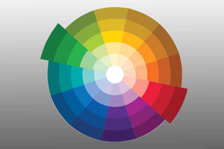
First stop: The color wheel

If you want to try using complementary colors in your photography, you need to learn how to recognize them first. The best way to do that is by relying on the color wheel.
The color wheel is a very visual representation of the relationships between colors – when they’re arranged in a circle it’s really easy to see the natural order they follow.
Using the color wheel you can take advantage of different color harmonies – complementary, monochromatic, analogous and triadic are just a few of the most popular ones.
In case you feel like exploring this topic further, have a look at our article about color theory for photographers and you’ll surely find a lot of helpful insights!
What is a complementary color harmony?
An example of complementary harmony with red & green.
Have a look at the color wheel and pick a random color. Now look at the exact opposite side of the circle and see which color lies there. The pair of colors that you just discovered is called complementary harmony.
The classical and most recognizable complementary pairs are red & green, blue & orange, and yellow & purple.
These color combinations are widely used in all sorts of visual communication nowadays, so they’re basically a safe choice whenever you’re looking for dramatic impact but don’t feel like experimenting too much.
Complementary colors have quite an intense relationship and they tend to literally boost each other, which creates a strong color contrast.
Having this powerful contrast in photography can be genuinely beneficial for your image, but you also need to be careful when using this technique.
This is because such intense color combinations can draw all the viewer’s attention and thus overpower your photograph completely.
How to soften the effect of the complementary colors
If you want to avoid going over the top with this classical color harmony, you definitely have a few “escape” options to take into account.
The first one is to soften one of the colors (or it could be both of them). This can be achieved by creating a new tint out of your base color – or in other words by simply adding white.
If you go for adding grey to your base color (instead of white) what you’ll get is a new tone. And you also have the alternative of adding black in which case you’ll get a new shade.
Playing with freshly created tints, tones and shades can calm down the crazy color contrast and can also ensure that the colors won’t steal the spotlight entirely.
How Much Do You REALLY Know About Photography?! 🤔
Test your photography knowledge with this quick quiz!
See how much you really know about photography...

The second way to take advantage of complementary colors in a more moderate manner is to use one of the colors as an accent and let the other one dominate. This is a very creative decision that can grab the viewer’s attention in a subtle but gripping way.
The third option that stands before you is to choose a slight variation of this color model: it’s called the split-complementary color scheme.
The logic behind it is basically the same, but this type of harmony naturally comes across as more balanced than the direct complementary.
Remember the opposite of the color you chose when I was first explaining the fundamentals of complementary colors? Now instead of picking the direct opposite, look at the colors which stand directly to the left and right of it.
Now take those two colors and use them as companions to your main color.
A classic example of such harmony would be aqua blue combined with yellowish-orange and red (instead of simply going for pure orange to accompany the aqua blue).
Examples of Complementary color schemes
Examples of complementary colors combined together in a piece of art or simply on a TV advert are everywhere around us. You can see them in the movie theatre too – now you know where this super popular orange & teal look comes from!
Try to look for complementary color schemes first. Once you really start noticing them it will become much easier for you to apply these techniques in your own photography work.
Below we’ve put together 30 beautiful examples to get inspired by. Enjoy!
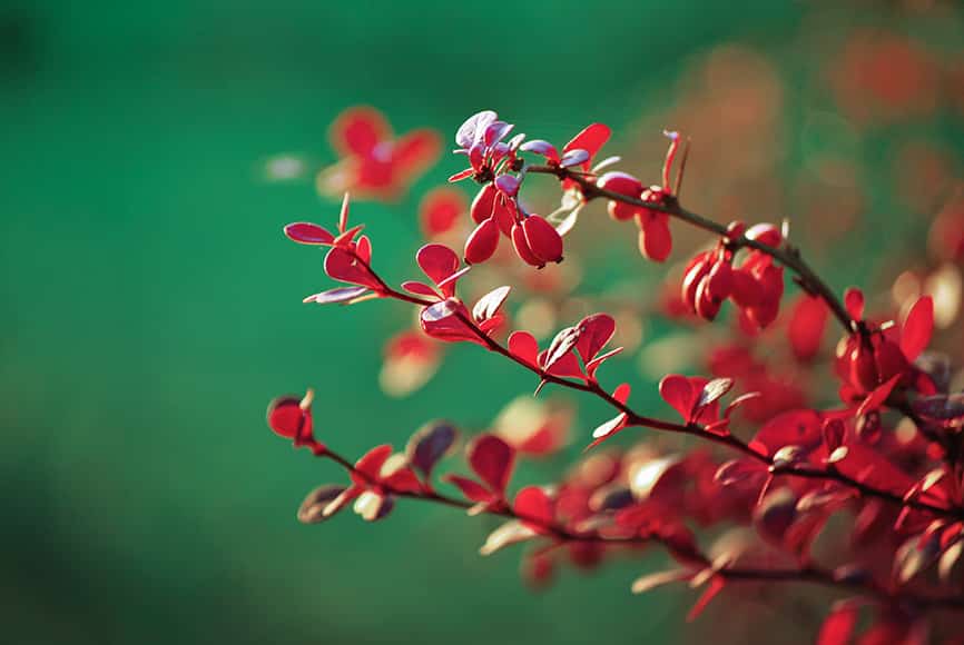
Red & Green Colour Harmonies
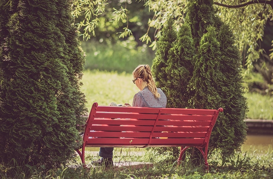
Woman on a bench | © Alex Blajan
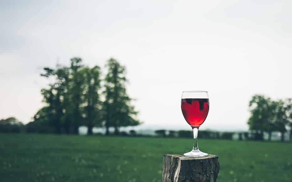
Glass of wine | © Jamie Street
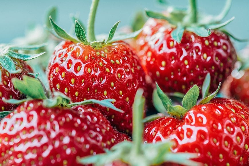
Strawberries | © Jez Timms
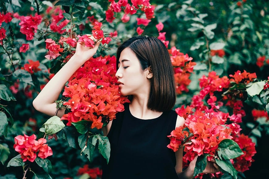
Floral portrait | © Marco Xu
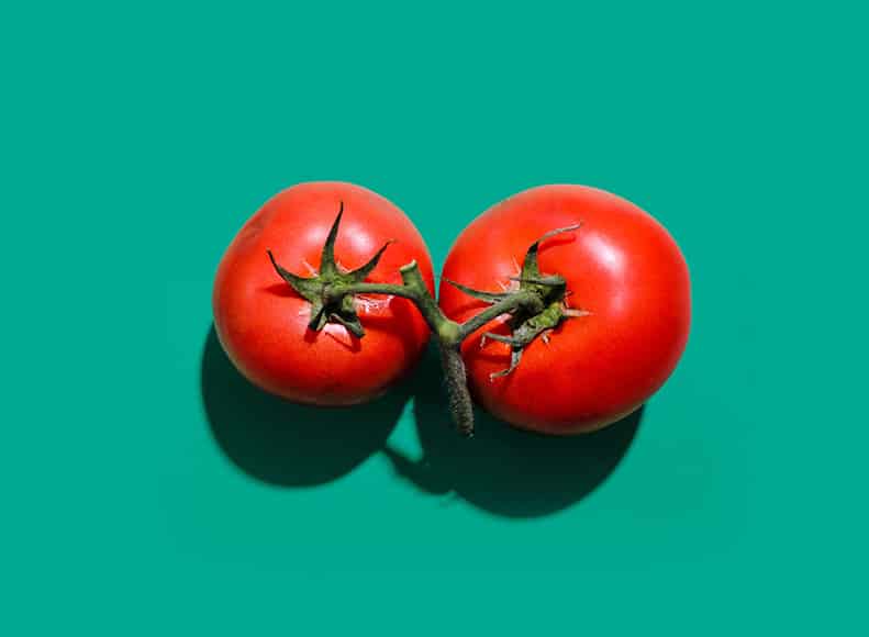
Tomatoes, minimalistic | © Shiro Yamamoto
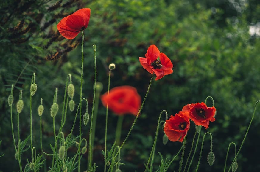
Red poppies | © Sorin Gheorghita

Portrait | © Fernando Dearferdo

Under the willow | © Grant Ritchie

Bamboo forest | © Walter Mario Stein
Blue & Orange Colour Harmonies

Frozen | © Aaron Burden

Beach fun | © Aziz Acharki

Orange umbrellas | © Catrin Johnson

Sunset silhouette | © Kym Ellis
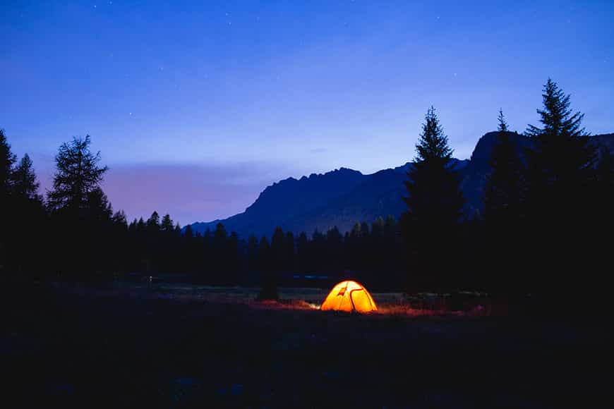
Orange tent | © Luca Baggio

Jellyfish | © Michal Pechardo

Orange slice | © Mae Mu

Blue & Orange seats | © Nacho Capelo

Minimalistic | © Oleg Laptev

Climbing up | © Tim Tiedemann
Yellow & Purple Colour Harmonies
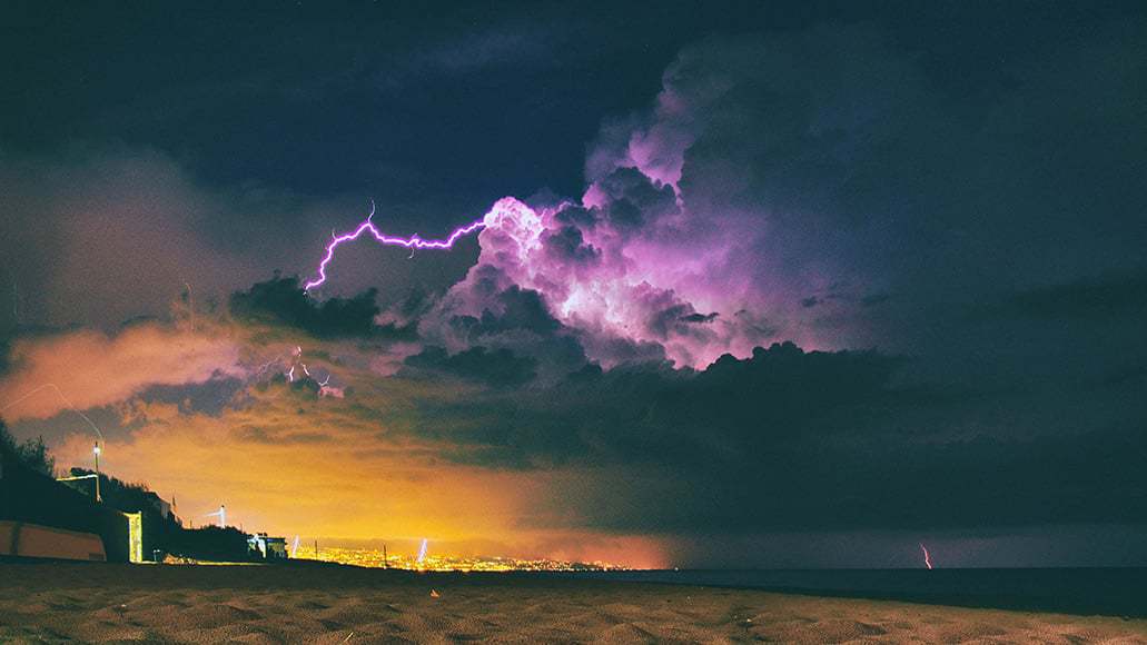
Summer storm | © Andras Kovacs
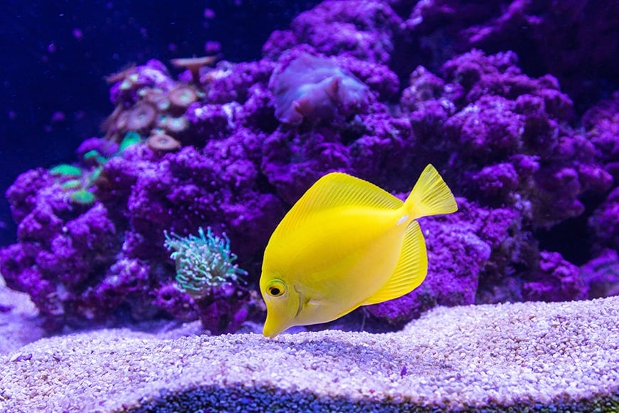
Yellow fish | © Craig Lovelidge
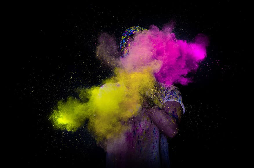
Colour explosion | © David Becker
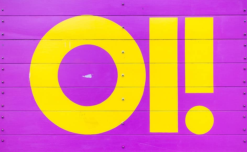
Oi! | © Francesco Casalino

Mystic morning | © Joey Kyber

Concert vibes | © Jules D

Grow lights | © Scott Pomfret

Fruit pattern | © Shiro Yamamoto

Yellow salamander | © Shiro Yamamoto

Product image | © The Creative Exchange
Final Words
Now you know what complementary colours are and you’ve looked through a bunch of great examples to get you inspired. The next step? Look around and discover such complementary pairs of colours for yourself.
Now, many of us may be restricted or on lockdown due to recent events – but even so, you can set yourself a challenge and try to explore your own home from a different point of view.
It could really be anything – from the way the blue sky matches your orange blooming potted flowers to the way your pajamas go with the colour of your slippers. Don’t stop looking!

Check out these 8 essential tools to help you succeed as a professional photographer.
Includes limited-time discounts.


Hi there! I’m Polina, a freelance photographer, always on the look out for creating simple images with powerful impact.

👋 WELCOME TO SHOTKIT!

🔥 Popular NOW:
