Two issues have been troubling me recently: 1. Coming up with ideas to write about on this blog, and 2. Not being inspired enough to write or draw (i.e: create). So, as some one fond of cliches might say, I’m going to knock out two innocent birds with a single pebble by starting a series of posts about the things and people that inspire me. I’ll start with Tom Oreb.
~~~
Tom Oreb is a bit of an elusive artist for me – I’ve been aware of Oreb for a while, but I still know next to nothing about him. From what I can tell, he was a behind-the-scenes man at Disney around the 50s and 60s, designing character and animating for some films (such as Sleeping Beauty), but he seems to have worked mostly on advertisements. He simplified the designs of some iconic Disney characters for car adverts (and such). This advert is one of the few examples of his artwork that I can find, outside of model sheets for the Disney films. That said, I find the model sheets and rough drawings far more interesting than the adverts.
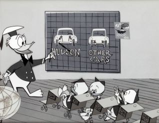
What I like about Oreb’s style is the simplicity of the designs. His drawings are quite flat, though they still look visually appealing. He seems to mostly use angular, two-dimensional shapes. Donald Duck’s head is the closest thing to a circle I can find, but that’s not exactly a perfect circle, is it? It’s a squashed, sharp circle – the top is flat, probably to keep the hat from slipping off? I think this use of sharp edged shapes and the dominance of straight lines over curves is the defining characteristic of the 50s style (though, I’m no expert). The designs are also stripped of all the unnecessary details that usually bog down character designs, which helps.
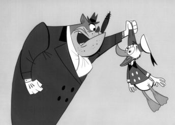
His line quality is something that also appeals to me, though I can’t find a logic to it. Why did he use thicker lines there and there, and not here or there? Usually you would draw thicker lines where the shadows are, and use thinner lines where the light hits the subject. But in Oreb’s case, his drawings are flat so lighting isn’t a helpful guide. From what I can tell, he only used varying thickness in the lines to make the characters pop-out, or look more dynamic – or maybe he didn’t think about it at all, and it’s all a happy accident. Either way, the variety in line thickness makes his simple designs look more interesting.
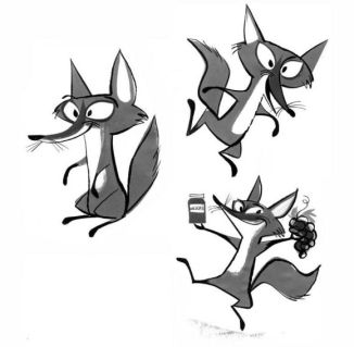
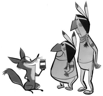
Look at that fox! Isn’t he wonderful? I think it’s the best example I’ve found of Oreb’s style: simple designs, stiff and flat, but with lots of character. Look at that smug grin on his face as he shows off his jam and grapes, and look at that salesman smile as he tries to sell it to his Native American buddies. Isn’t he great? And all he essentially is is an angular oval and a thin rectangle (and all the other little shapes and blobs that make up his ears, face and tail — but never mind those). He is, I’m not afraid to say it, the most attractive fox of the 20th century.


I did manage to find a few examples of depth in Oreb’s work, such as the rabbit and sleeping-painter pictures above. They’re still quite simple, I think, but they show how skilled he was at composition and layout as well as designing eye-catching characters. The rabbit is especially good. It was part of a model sheet for the rabbits in Sleeping Beauty, but I think this picture can stand alone as an illustration in it’s own right.
…That’s all for Tom Oreb. With hope, I will uncover a treasure trove of his art lurking somewhere in that cobwebbed corner of the internet that no one wants to go near.

Whoa! Love his style. I think I like the smoothness from Muradov’s more but his flatness is also so appealing. I got to know his name finally from this post. Thanks.
LikeLike